|
|
|
The article below was written for and published in the Spring 2010 issue of Quarterly News, and follows on the article Nose Art: The Year of the Tiger in the preceding issue of the Guild's newsletter. ----------------------------------------------- And now, Cover Art…In the post-war era, book covers have become vitally important as the book industry has become commercially competitive. Covers now give detailed hints about the style, genre and subject of the book, while many push design to its limit in the hope of attracting sales attention.
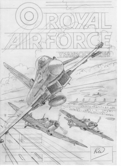
It has been several years since I first began to the paint for the covers of the RAF’s official Yearbook. As an ex-scientist and self-taught painter, and unlike many of our senior colleagues, I did not have the advantage of a background in illustration and graphic design. I knew little of the formidable skills of these fields and their many techniques and materials, and so it was with some initial trepidation that I found myself following in Wilf Hardy’s footsteps. Yet I had not been totally unfamiliar with some of the ways and practices of commercial art, having years before been unwittingly drawn into the world of art prints, as well as having had my artistic creations severely cropped to fit a range of ill-fitting book covers. For me the first mental departure in creating a cover image de novo was that the image had to be designed from the start for an upright A4-size cover….no more of that familiar and stately horizontal/landscape format here. The thing also had to be conceived as a whole, taking into account all the ancillary components in the existing cover design: the title, captions, banners, bar code, etc & etc. Even a possible CD which may be affixed to the front of the yearbook. In practice, when I got down to it, and with some helpful guidance from Wilf, the experience proved less unsettling than I had initially feared. No, I did not uproot myself to embrace the mysteries of pen and ink and gouache and airbrushing and the like. As in the case of the nose art episode(QN Spring 2010), I fell back upon methods and “materials immediately available”. I continued to paint in my accustomed manner using acrylics and/or oil colours, on to stretched canvas( I could never get used to board or card). The important point with the canvas was to ensure firstly that its surface was of a very fine and even grain, and secondly that the painting had a sufficient margin in size so that it would reduce comfortably to give a nice clear A4 image*. The primary requirement for the image, I soon discovered, was not just artistic as well as technical merit, which had to be there for all to see, but that it should visually jump out at the potential customer from amongst all the rival publications on the magazine stands. So it’s not so much here the classical horizontal sweep of visual space, but a maximal emphasis on perpendicular depth and punch**, using every artistic means on hand…..composition, perspective, colour, lighting. “In your face” was the keyword….which probably applies to designing any attention-grabbing advertisement, including the likes of those Guild Annual posters.. Every year Peter March, editor of the RAF Yearbook, would contact me a few months ahead of the copy date and inform me of the chosen theme for the coming issue of the Yearbook, which for this year is the Battle of Britain Memorial Fly-by at the RIAT led by a Eurofighter Typhoon. I would then submit one or more drawings for the consideration of their committee, as in Figs1 & 2. I selected for the cover image the dynamic moment when the flypast split formation and went their separate ways. Using as a template the cover layout from preceding issues of the Yearbook, it really is not that difficult to design the painting composition so that everything which needs to be there on that cover fits in reasonably sensibly.
Fig. 1
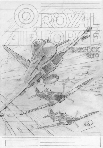
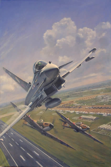
Fig.2 When the committee has indicated their choice of composition I can paint away. And on completion of the painting I e-mail a digital snapshot(Fig.3) to the editor for checking and approval. Once approved, the painting is photographed professionally, and the digital file*** can either be sent to the editor on a CD or, as we discovered recently, e-mailed direct to the RAFCTE. Their Design and Production Department will then use the image to mock up the forthcoming cover( Fig.4), and in turn send me a copy of the proof for my edification. The internet really is a boon.
Fig.3
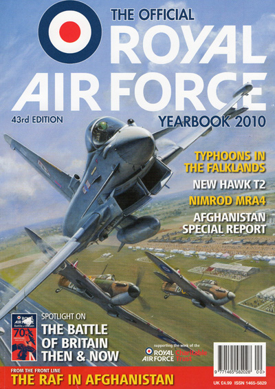
Fig 4 And at the end of it all, the artist is left with a bona fide painting available for the Guild Annual a few months further down the line! That is, after first trimming off a few inches of excess canvas along the top where room for a large eye-catching title is no longer required. Ronald Wong GAvA *A general principle in image reproduction is you always try to print downwards in size from the original painting, and not in the opposite direction, if you do not want to risk the resulting image becoming unwittingly impressionistic.
|